The online bet applies
bwin
Logo & Corporate Design
betandwin becomes bwin. The new logo should incorporate as many elements as possible to ensure maximum recognition. The necessary step should also be taken as a logical consequence of the company’s portfolio expansion.
Both typography and colour codes are retained. The picture elements (arc and ball) shrink to the i-point, which is also the “dot” of the Internet address. Thus, the logo is not only “redesigned”, but above all “reduced” to the essential elements without losing its character.
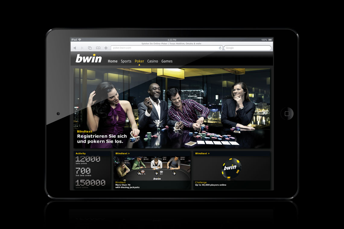


Branding